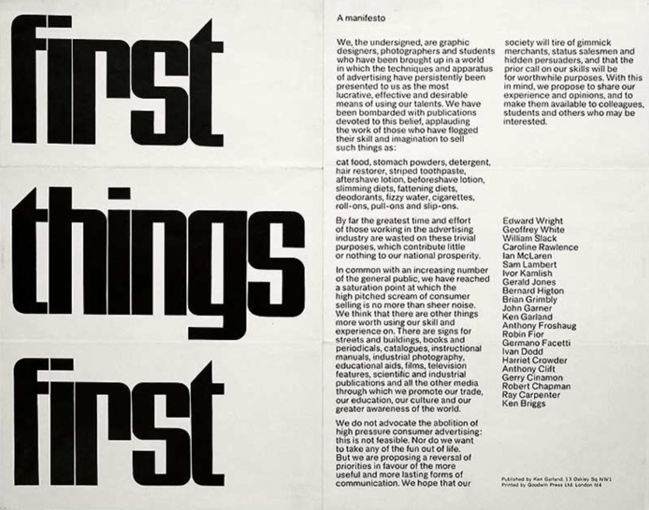
The municipality of Saint Gilles/Sint Gillis is renowned for its multicultural population and heritage.
Situated in the south of Belgium’s capital city, its reputation as a buzzing home for diversity attracts tourists and homesteaders alike, being one of the most vibrant and rapidly changing boroughs of the city. The local council approached us and voiced the need to create a unifying visual identity that would speak clearly to both visitors and inhabitants. Saint Gilles’ logo and pictogram were too heavy, their name too wordy and therefore too complex. These being one of the main tools used by the council to engage with its constituents, it was time for a change.
We decided to approach the redesign of Saint Gilles/Sint Gillis’ identity as we would a brand.
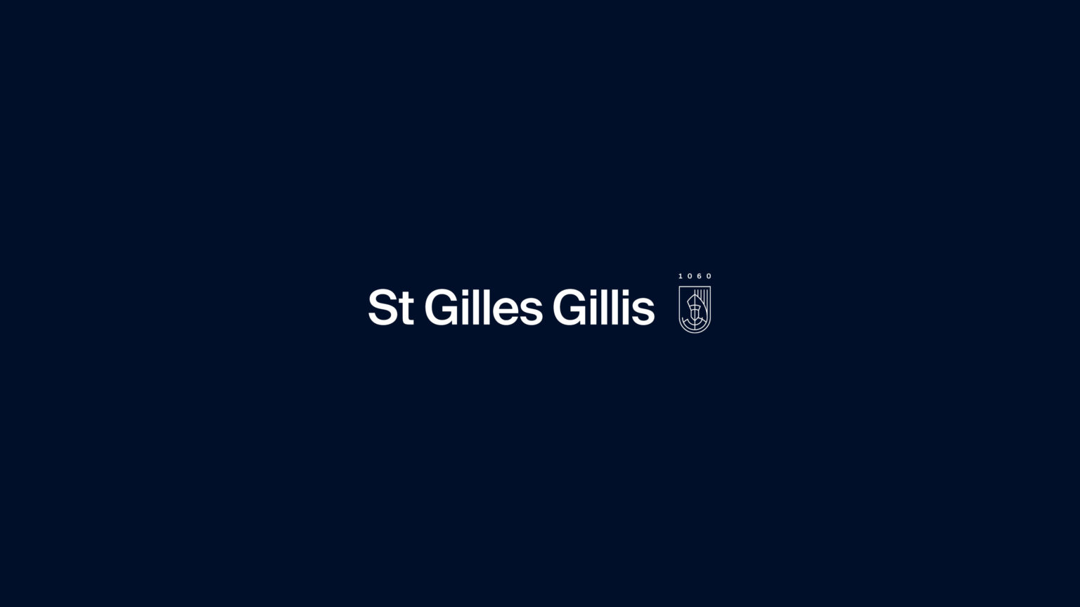
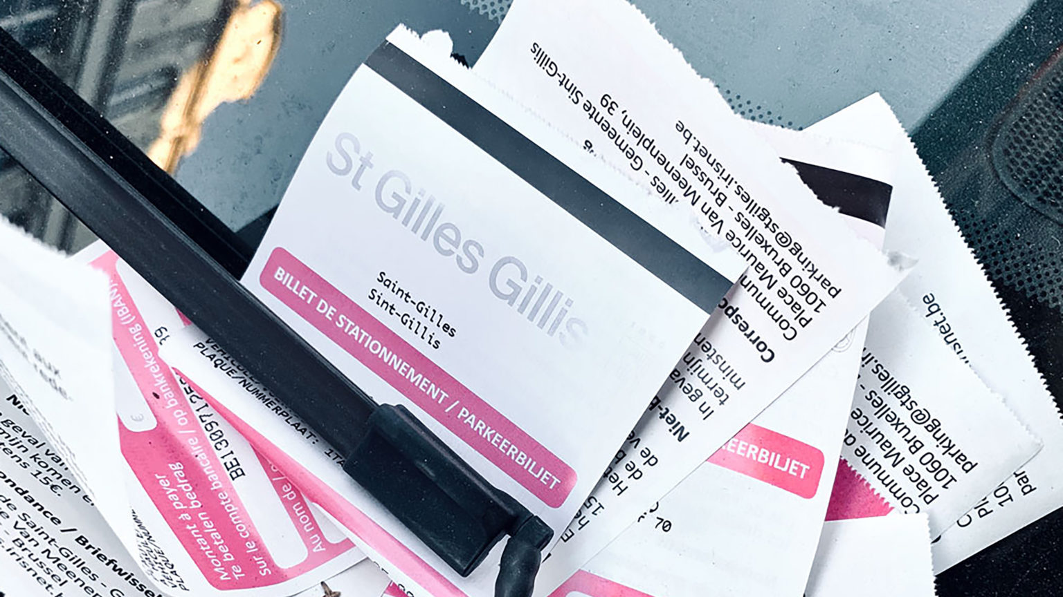
After a phase of analysis and diagnostic of the situation at hand — as well as a series of hands-on meetings with the local council — it appeared simple: not only did the design have to be tackled, but so did the name. Stripped back, “Commune de Saint Gilles/Gemeente van Sint Gillis” became “St Gilles Gillis”.
This project involved complex and layered talks with the client. We interacted fully with local council members and political representatives during all phases of the project, taking into consideration their challenging feedback in order to reach more than just a consensus, but to generate enthusiasm regarding the rebranding.
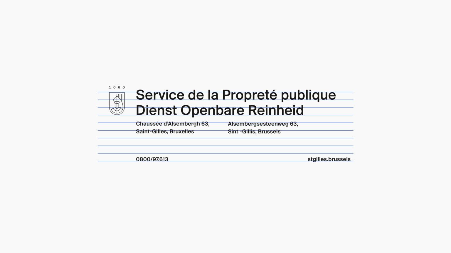
Traditional heraldry featuring the local patron saint was also simplified and capped by the postcode (1060) to create a pictogram.
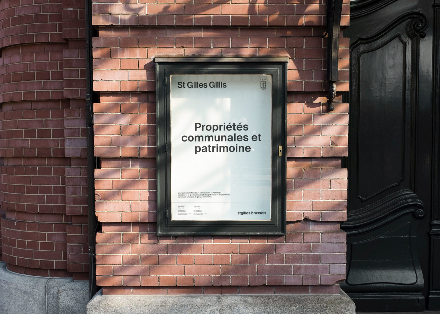
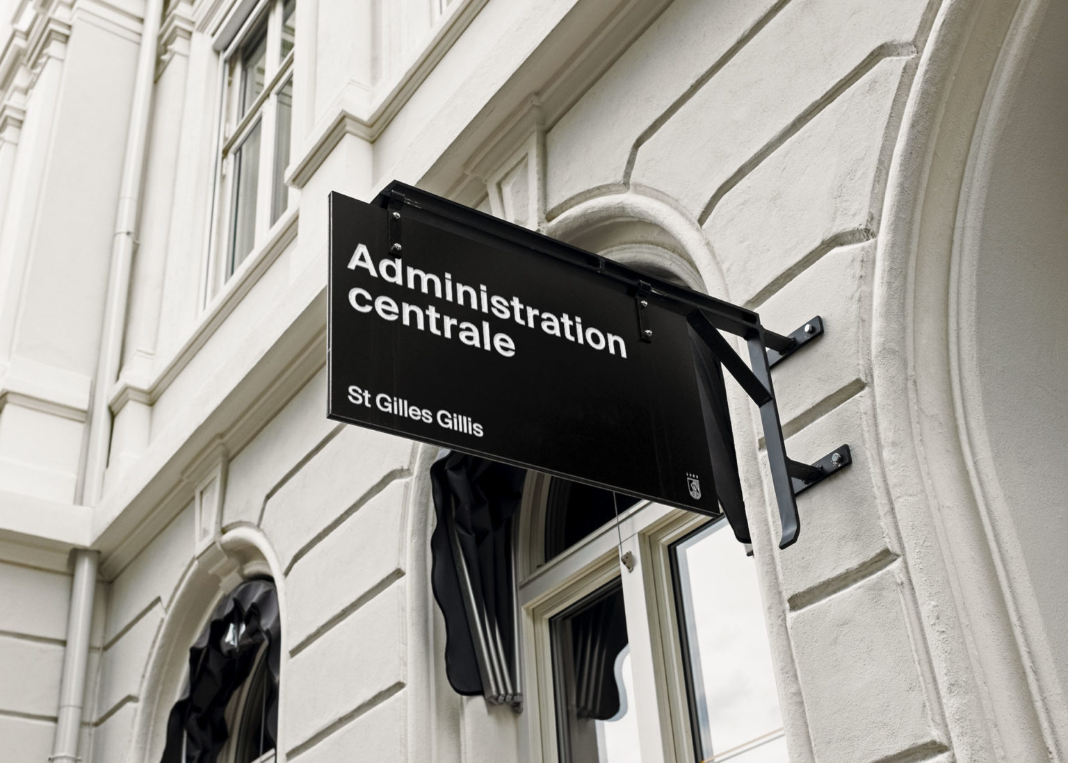
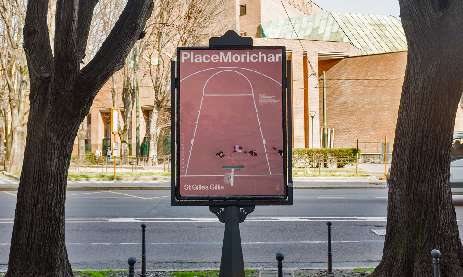
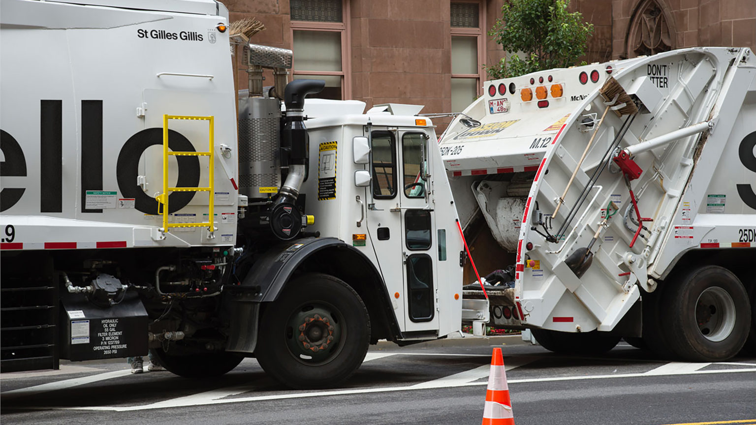
Paired with the lively, no-frills typeface Suisse int’l medium, this made for a logo that could feature effectively on small communication tools (envelopes, letterheads and email signatures) as well as large-format ones (rubbish collection vehicles, municipal staff clothing, and public signage).
We made the radical choice of using just one sans serif typeface in one weight. This guarantees both a long-lasting design across all media and ease of use of the identity by municipal staff and external partners if required.
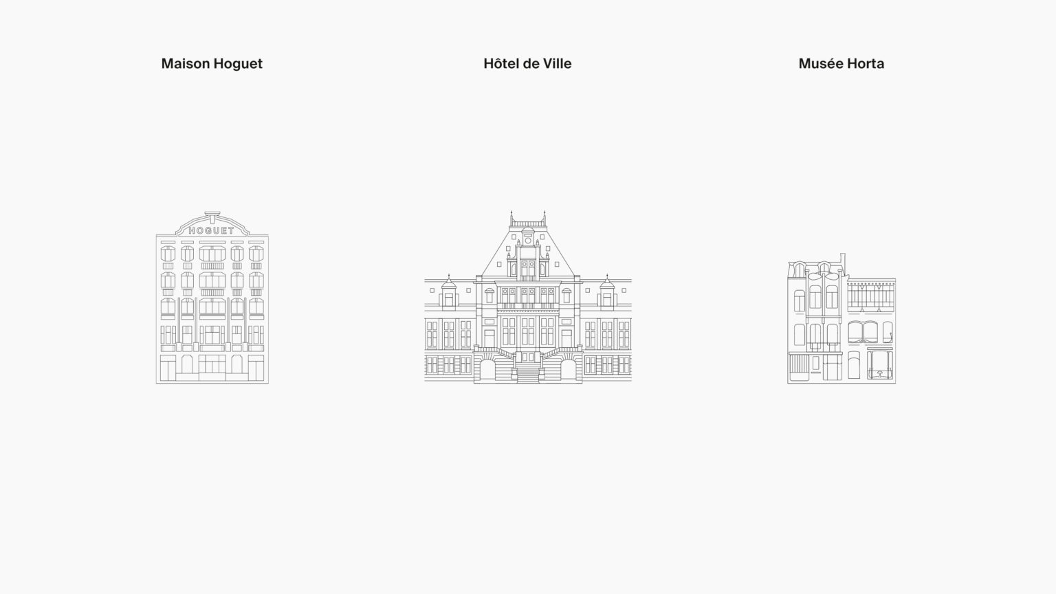
Rethinking St Gilles Gillis channeled something essential to the municipality: its architecture and landmark buildings.
Intricate yet simple and recogniszable line drawings of the local places where all things administrative happen were produced to be featured on the corresponding services’ stationery and signage.
The identity was also partnered with the idea of the municipality becoming a friendly, approachable voice addressing its inhabitants in each and every language spoken by them.
TEAM :
WOJTEK & OLIVIER FOR THE DESIGN